Every month, I do a live critique of landing pages and give feedback to course creators. I’ve reviewed hundreds of landing pages over the years. Here are the top 5 copywriting mistakes I’ve seen:
1. Being too vague in your bio on your landing page
I often see experts downplay their accomplishments. But the bio on your landing page is your one shot to impress your prospective student—don't assume folks will Google you. The key is to make your bio specific and relevant to students. Here are examples to go from vague to specific:
🚫 Vague: “Partnerships” → ✅ Specific: “5 years at Google leading global partnerships”
🚫 Vague: “Led growth teams” → ✅ Specific: “Head of Growth at WhatsApp, built growth function internally”
🚫 Vague: “Startup advisor” → ✅ Specific: “Advisor to 20+ startups (3 were acquired)”
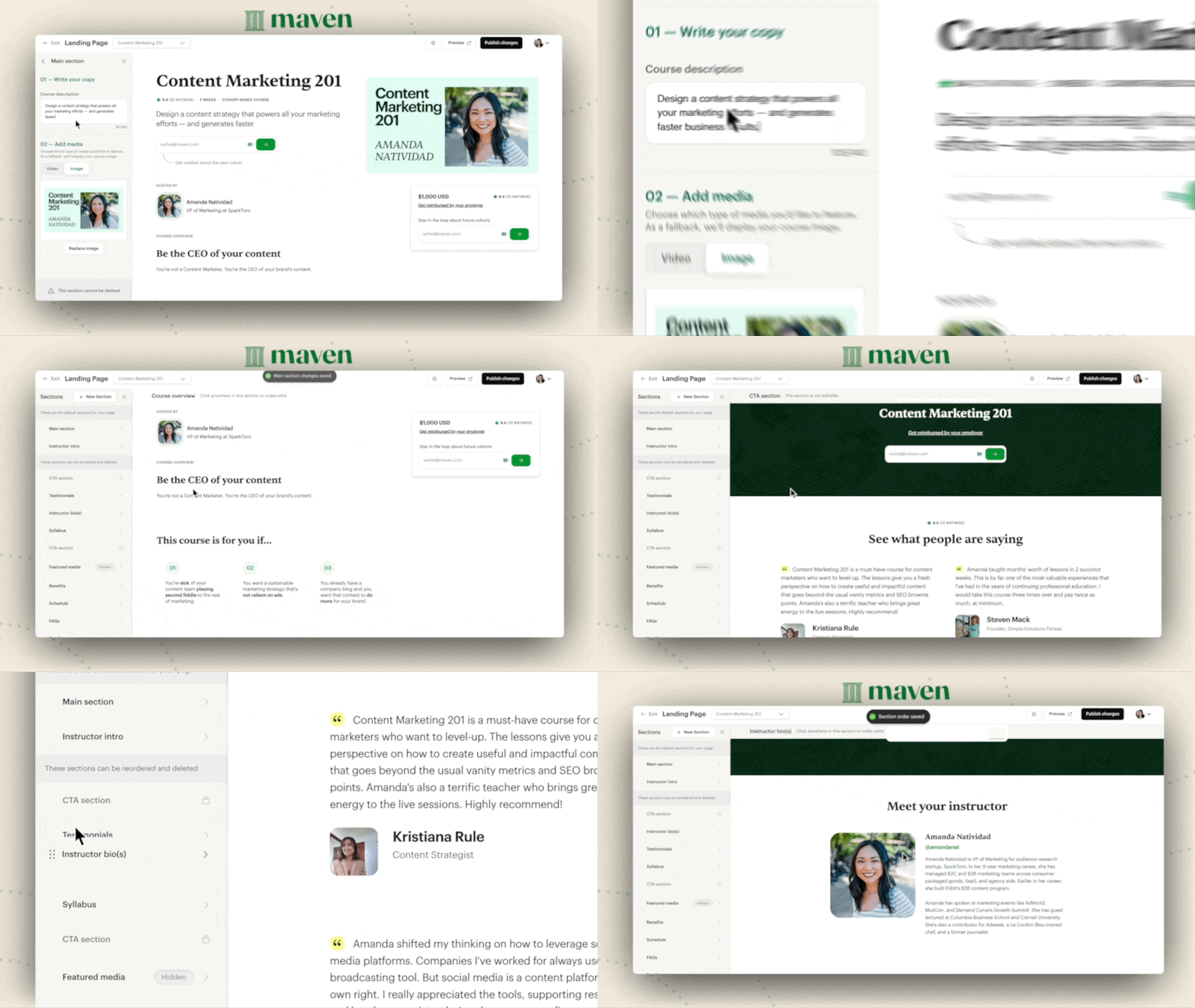
By the way, Maven offers an intuitive landing page builder with pre-filled sections. I also teach how to build landing pages in the Maven Course Accelerator.
Secure your seat (it’s free).
2. Not talking enough about your target students’ problems
Most messaging is me-focused: “I worked at X company. I specialize in Y. I have these customers.” Your audience reads this and thinks, “How is any of this relevant to me?”
This is a missed opportunity.
Instead of rattling off your work history, talk about your target student and the specific problems they’re facing. When you speak with insight and detail, a magical thing happens: People assume you know how to solve the problem. When you’re vague, your audience assumes it’s because you’re not able to go any deeper.
Ask yourself:
What are day-to-day problems that your ideal student struggles with?
What are the mistakes you’ve seen others make (or you’ve made)?
What’s a non-obvious approach to solving this problem?
3. Your product is a vitamin, not a painkiller
A vitamin is a nice-to-have. A painkiller is a must-have. When you’re selling a vitamin, you’re trying to convince someone who is mildly dissatisfied to take a big leap. It’s hard to drive action from these folks. Sometimes this can be fixed with better copy, but often it requires rethinking your offer.
🚫 Vitamin: “How to start a consulting business” → ✅ Painkiller: “How to get your first 10 consulting clients”
🚫 Vitamin: “How to operate a startup” → ✅ Painkiller: “How to fundraise in a down-market”
🚫 Vitamin: “How to improve your work with a virtual assistant” → ✅ Painkiller: “How to offload low-level tasks to an assistant and save 20 hours a week”
4. Lack of differentiation from other courses
Imagine you’re building a course on leadership. There are thousands of existing leadership courses, many of which are free. So, how do you stand out?
With your spiky point of view.
A spiky point of view is a perspective others can disagree with. It’s a belief you feel strongly about. It’s your thesis about topics in your realm of expertise. The more spiky POVs you share on your landing page, the more you will attract your target student. You want your prospective student to think, “If they’re willing to share these insights for free, their paid stuff must be insanely good.”
Here are questions to inspire your spiky POV:
What’s something you believe in your area of expertise that others might disagree with?
What do you wish more people understood about solving X problem?
What’s a best practice you disagree with?
5. Your student transformation is unclear
Two big questions to answer on your landing page:
What transformation do you want to create in your students?
What will help your ideal student achieve that outcome and transformation?
Whenever you get stuck, refocus on these questions. Remember that your students are paying to be transformed. They want to learn a new skill, become a better version of themselves, and get ahead in their work. Your course is a vehicle to help them get to where they want to go.
Show how your methods have transformed the lives of your past clients, companies, teams, or mentees. Sprinkle these stories throughout your landing page and, when possible, share numbers to make the examples feel concrete.
🚫 Vague: “Grow your revenue” → ✅ Specific: “Grew revenues 4x from A to B”
🚫 Vague: “Hire faster” → ✅ Specific: “Reduced time to hire from X to Y”
🚫 Vague: “Convert more” → ✅ Specific: “Increased conversion by 20% for X”
PS Maven's landing page builder is a favorite feature among instructors. Here’s what they have to say about it:
“The super simple and effective landing page builder is fantastic. It takes the guesswork and technical challenges out of capturing attention and selling courses.” - Kasey Jones
“The landing page is super easy to build a course. The sections are well thought out.” - Georges El Khoury
“The placeholders on the landing page are easy to follow and easy to use. Even beginner course creators would find the interface very intuitive.” - Carl Seidman

When you start earning on Maven, you keep 90% of your course revenue minus Stripe fees. On average, instructors earn $20,000 in their first cohort. Plus, you own your IP and content. Our goal is to help you launch and grow a course you’re proud of.

